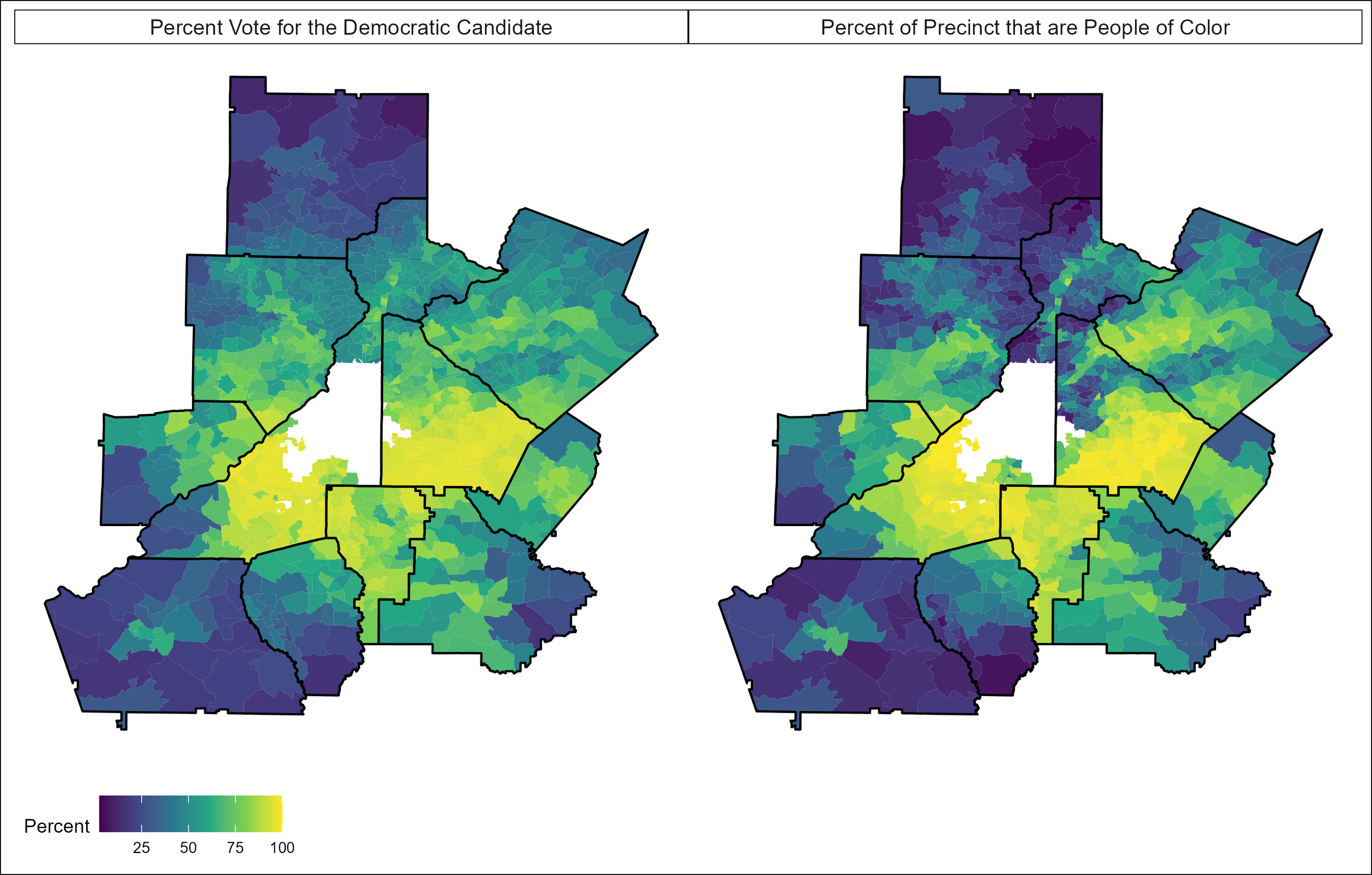
Maps of People of Color and Democratic Voter Turnout in Greater Atlanta During the 2020 Presidential Election
Precinct-level Election Data come from the New York Times and race/ethnicity data come from the American Community Survey's 2019 5-year Estimates pulled from NHGIS.org.
Quantitative data have the power to shift dominant understandings of issues central to racial justice. For example, scholarly research and news media typically treat people of color as urban populations confined to big cities. Yet most people of color live in suburbs. Having an accurate understanding of where people of color live has huge implications for the U.S. nation-state.
Suburban people of color fundamentally impact electoral politics. During the 2020 election cycle, I noticed that lots of news media focused on how suburban White women were going to vote. These narratives typically ignored the more than 70 million suburban people of color that the election hinged on, especially in crucial places like Georgia. I created the maps above to show that suburban people of color are part of an overlooked but powerful constituency that can determine the outcome of elections.
These maps show suburban counties surrounding Atlanta, which appears in white at the center, during the 2020 presidential election. The first map shows where Black, Indigenous, and other people of color (BIPOC) live in the Atlanta suburbs–lighter colors (e.g., yellow, green) indicate greater concentrations of BIPOC in suburbs, and darker colors (e.g., blue, purple) indicate lower concentrations of BIPOC (i.e., Whiter suburbs). BIPOC includes Black, Latinx, Asian, Indigenous, and other folks who do not identify as White in the Census. The second map shows the local percentages of folks who voted for Biden. Yellow equals more votes for Biden and blue means fewer votes for Biden (i.e., more for Trump).
These maps tell us two very important things. First, lots of BIPOC live in suburban Atlanta. More than 90% of Greater Atlanta’s BIPOC population live in suburban areas. We see lots of bright yellow concentrations of BIPOC south of the city as well as towards the east. These suburbs are nearly 100% BIPOC. Second, when we look at the Democratic vote map, it looks very similar to the BIPOC map. Generally, suburban places where people of color live show a higher turnout for Biden. Suburban places where White people live show a higher turnout for Trump. These suburban places are critical sites in the democratic process at both state and federal levels.
For folks familiar with race and voting, these maps may seem obvious. But dominant narratives and news media tend to ignore the suburbanization of people of color and focus only on White people in suburbs. Most people of color live in suburbs across the nation, and this data visualization shows the impact of suburban people of color on the democratic process.